Posted on January 16 2020

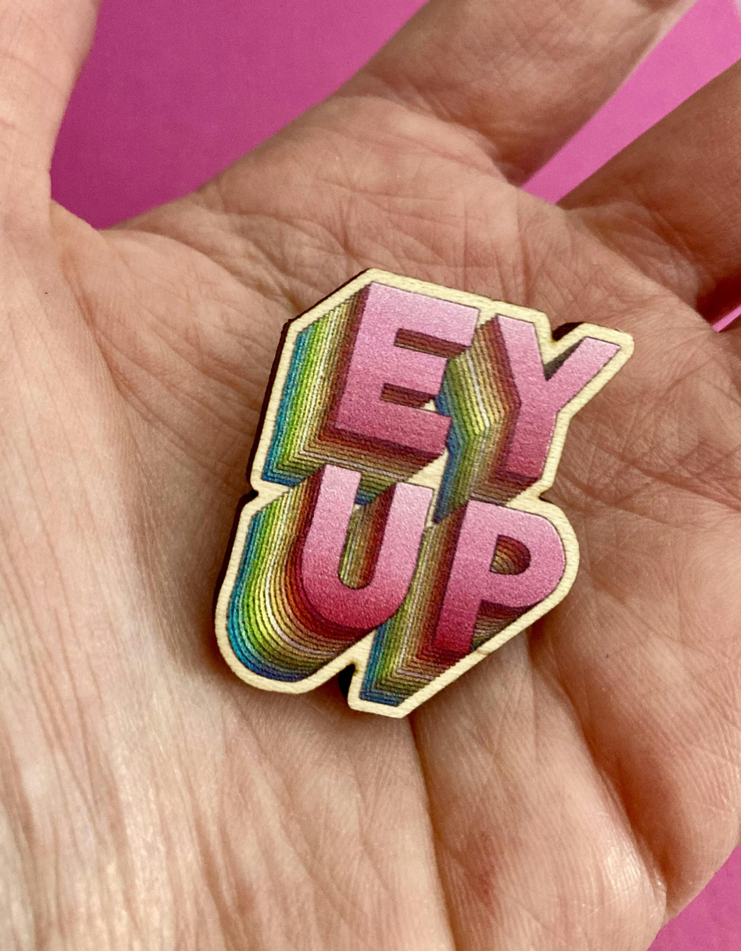
Similarly to when we gesture or use facial expressions while talking to one another, the typography used in our print and designs is able to reflect different tones and emotions to the reader. Getting your choice of fonts right is just as important as picking the right colours and logos, if not more so.
With thousands of typefaces out there to choose from, whittling down the right font for your brand or promotion can seem a little daunting at first. Though we’d be here all day if we talked you through each and every style available, we can give you some handy tips to help you out while choosing the right typography for your pin badge, keyring and sticker designs.
Consider the Message or Purpose of Your Design
Your first port of call should be considering the message you’d like to send to your clients or customers, or the purpose of your product or material’s design. Get the font right, and your design will speak the same language as your demographic. When deciding on your typography, you should consider:
- The function of the font
- The context the font will be used in
- The environment the font will be used in
- Which emotions you’d like the font to evoke
Stay True to Your Brand
Companies wish for their brand to communicate and portray personality to clients and customers; an effective means of achieving this is through incorporating the right kind of typography for your brand.
Each specific font has its own set of attributes that aid in communicating this personality and bringing together your design and brand message as a whole. You should decide how you wish your brand to be perceived and go from there, the likes of solicitors and financiers should go with something traditional and reliable, while a clothing company or hair salon might want to go with clean and contemporary typography.
To get you started, we’ve outlined three attributes of the main three font types:
- Serif fonts - reliable, safe, traditional
- Sans serif fonts - clean, contemporary, modern.
- Script fonts - elegant, graceful, romantic.
Make Things Clear, Concise & Readable
You’ve outlined the purpose of your material and your brand’s personality, now another important factor to consider is the legibility of your typography.
The key to a successful font lies in its simplicity as well as its ability to give your design some character, and the more legible the material – the more likely it is that the reader will digest the information presented.
Titles usually pose no problem, rather it’s the body of text that you should check and re-check for readability. We recommend setting the typeface to 10px during the design process, if the typography is still legible, the font is fine!
Avoid Font Faux Pas
Which typography you choose is, of course, entirely up to you, but there are a few font-based faux pas that you should avoid along the way.
We’ve included some aspects that you should be aware of while designing the likes of custom shaped stickers and kiss-cut stickers to ensure that your font choices do their job.
- Limit the number of fonts - overdoing your typography confuses the eye and detracts from your design. You should avoid using more than three fonts on any one design, alternating the size of each rather than adding another into the mix.
- Avoid using fonts that are similar - the whole idea behind alternating your typography is to create something that is visually diverse, so picking fonts that are similar to each other is completely counterproductive! Make sure that your fonts differ enough to benefit your design and get noticed.
- Create contrast, not conflict - it’s important that your font choices contrast each other, but there’s often a fine line between achieving this and creating a conflicting, confusing design. To ensure that your typefaces work together in harmony, pick fonts that have one thing in common but are otherwise different, e.g serif and sans serif.
Did you find our guide helpful? Let us know by following Zap! Creatives on Facebook, Instagram and Twitter. For more handy how to’s and product information, browse our help and advice centre.